NY Times reporter David Leonhardt has a story today titled “Do Covid Precautions Work?” His answer, based on data from various states, is that vaccines are very effective at keeping people from dying but that other efforts like social distancing and masking don’t seem to make much difference against Omicron.
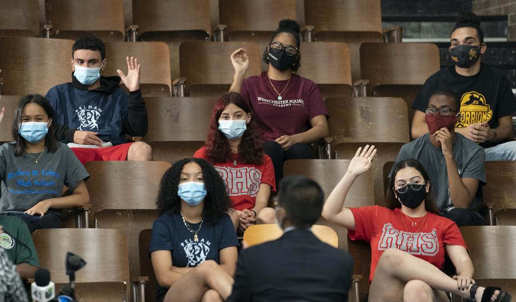
Even blue states have lifted most masking rules at this point. On the west coast, several states are lifting some of the final mask mandates this weekend. Nevertheless, Leonhardt points to data suggesting things are less likely to be back to normal in blue states. For instance, restaurants are still well below capacity in blue cities while in red ones, the restaurants are back to pre-pandemic capacity. People are also more likely to be working from home rather than returning to the office in blue cities, though that’s arguably not just about Covid.
But when you look at infection rates based on the political preference of counties, what you see is that the blue counties aren’t doing better than the red ones.
No single statistic offers a definitive answer. When I look at all the evidence, I emerge thinking that liberal areas probably had slightly lower Omicron infection rates than conservative areas. But it is difficult to be sure, as these state-level charts — by my colleague Ashley Wu — suggest:

I’m guessing that blue counties and red counties are proxies for urban and rural areas. And those would also be proxies for population density. For instance, a blue county in Washington would be the area around Seattle and a red one would be a rural county in the eastern part of the state. So in each graph above the cities get hit early and the peak in rural areas trails that. Texas is a bit of an outlier likely because in Texas the urban areas are more likely to be red counties than in other states.
Leonhardt says he doesn’t see a pattern. I agree there’s no pattern that fits all of these but there is a hint of a pattern if you look at Ohio and Washington. Blue counties avoided the sharp peaks of infection seen in red counties but they also dealt with high levels of infection for longer. If the goal here was to avoid a peak that could overwhelm emergency rooms then the blue pattern might be preferable, but if the goal is simply to minimize the area under the curve (the overall number of people who get sick) then it’s not clear the blue strategy is any better.
But if masking and distancing were a mixed bag with omicron, the data shows vaccines were very effective at keeping people alive.

Here’s Leonhard’s conclusion:
The messiness of the previous charts has given way to an obvious pattern: Covid death has been far more common in red America. Over the past three months, the death rate in counties that Donald Trump won in a landslide has been more than twice as high as the rate in counties that Joe Biden won in a landslide, according to Charles Gaba, a health care analyst.
The second lesson is that interventions other than vaccination — like masking and distancing — are less powerful than we might wish.
Hence he argues we should keep pushing the vaccines because they will save lives but, unless some new variant appears on the horizon, it’s time to get back to normal. And given that the charts above go back to December, it has been time to get back to normal for a while now.


Join the conversation as a VIP Member