A tweet this morning caught my eye, and it really bugged me.
OUP has rebranded, and it's shite. pic.twitter.com/m5eBhEmPqF
— Andrew Cusack (@cusackandrew) September 22, 2022
Symptomatic of our entire age, all things learned and ancient are being flushed down the updated, minimalist loo logo revamp. Scrub that offensive Latin, throw in some radiating beams that hint of faint revolutionary fervor within, pare down the fussy font, and voilà! Contemporary, banal, and utterly indistinguishable from dang near any other recent revamp. How on earth will one be able to distinguish one university press from another any time soon?

Harvard stepped outside the box a smidge and went with a stack of bricks, which baffled me for a moment. Then I remembered that’s figuratively what they have ready for anyone who doesn’t join the hive – verbal abuse bricks to drive you from the campus. Makes perfect sense now.

Municipal logos are sleeking down.

As one person in the thread plaintively asked, “Where have all the serifs gone?” a “serif” being that slight little edge or flourish that finishes off a letter. They are an endangered species in today’s world.

They have been stripped off letters like the features from bollards, which were formerly lushly shaped and are now just fat poles…
The Danger of Minimalist Design
(& the death of detail)
A short thread… pic.twitter.com/byrgyZzl6O
— The Cultural Tutor (@culturaltutor) June 18, 2022
…and as absent as People of Color, who’ve been stripped from representation on the front of food packaging in the war over cultural appropriation, negative stereotypes, and RACISM, whether the claims were truly valid or not.
Uncle Ben’s rice changes name to more ‘equitable’ brand
…Uncle Ben’s entered the market in the 1940s and was for decades the best-selling rice in the US.
Its marketing has been criticised for perpetuating racial stereotypes.
Titles such as uncle and aunt were used in southern US states to refer to black people, instead of the more formal and respectful “Miss” or “Mister”.
The name Uncle Ben’s was supposedly inspired by a Texas farmer known for his high-quality rice. The company asked the head waiter at a fancy Chicago restaurant, Frank Brown, to pose as the face of the brand, which launched in 1947.
In 2007, the company sought to update its marketing with a campaign that cast Ben as chairman of the board, a move away from the previous, more servile presentation.
“We understand the inequities that were associated with the name and face of the previous brand, and as we announced in June, we have committed to change,” Mars said.
Pretty much nobody but white people left on hallowed older brands. The new packages are clean as a whistle, personality-free and meh. Well done, outrageously outraged progs. Minimalism wins again.
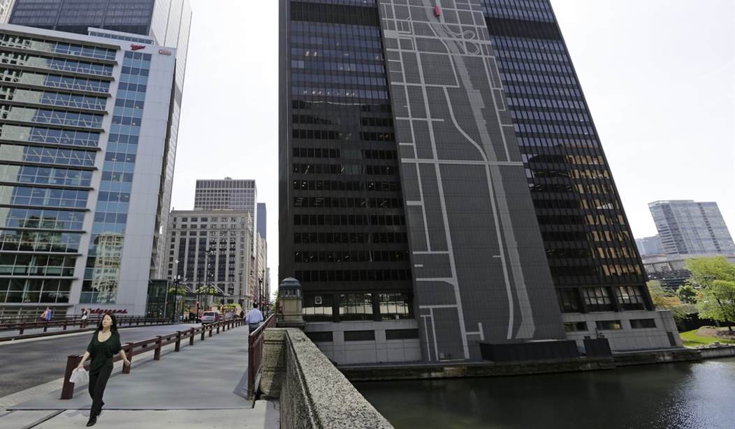
As diverse personalities as both President Trump and King Charles III might be, they have at least one thing in common – they despise ugly, featureless modern buildings. Trump had plans to change the trend at a federal level. It remains to be seen if any of it will come to fruition.
President Donald Trump took some time out before the holidays for aesthetic policy-making. On Dec. 21, the president signed an executive order setting a new standard for federal architecture. Civic buildings, the order reads, should be “beautiful.” The order itself doesn’t define this term in any concrete way, but it does provide several examples of buildings — all modernist — that missed the mark. Specially gift-wrapped for fans of neoclassical buildings, who have hoped for executive action since details of the order first bubbled up in February, the directive promotes traditional design as the gold standard for U.S. architecture.
Beauty is in the eye of the beholder, however, most beholders know crap when they see it. They’re too polite or too intimidated to say anything. In the self-serving liberal worlds of architecture, fine arts, and academia, they’re all busy patting themselves on the back for the brilliant clean lines of an “innovative” design that the citizens they’re supposedly designing for find a cold, oppressive blot on the landscape.
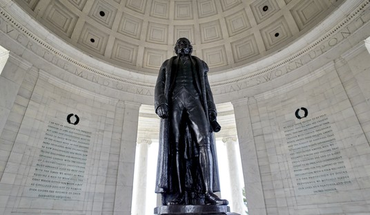
When all the logos look the same, the buildings all look the same, higher education no longer challenges students to be learned individuals, but members of a group think cult, life can turn pretty grey without realizing it. If you have nothing unique or beautiful to appreciate, or have no smallish things to notice – like a serif or feature on a building corner, for instance – pretty soon you notice nothing. As one of the posters said, “Default minimalist designs strips all identity away from things.”
These buildings, logos, retail packages, et al, they’re just ‘there’ – dang near indistinguishable from each other. Is this progressive minimalism a cause of the blindness on the part of our elected elites to uncontrolled crime’s effect on their citizens? Any of what were formerly accepted as social norms have been completely jettisoned, like that racist, white privileged Latin of a school motto, in the name of equity.
Nobody’s a victim, because they are all victims. No one individual’s suffering at the hands of another is more important than what prior supposed suffering fomented that act of violence to begin with. Identities are “stripped away” in this grey, homogeneous collective being foisted on us.
You know it’s gone too far when even the bollards have had enough.
Find something beautiful to appreciate this weekend. And share it.


Join the conversation as a VIP Member