Sarah Palin wins. Rick Perry places. Herman Cain shows. Mitt Romney fourth, and Tim Pawlenty fifth. Charts and analysis follow. Interactive map at the end.
It looks like Palin’s bus tour is getting her back into the survey groove she had earlier this year. The graphs to date:
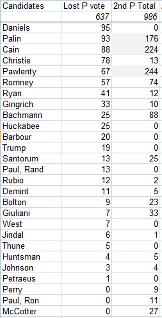
 The obvious eye-popper is Perry’s share of the vote in his first survey. Where’d all those votes come from? And why didn’t Pawlenty do better after Daniels’ exit, as we’d expected?
Those questions are easily answered when we dig a bit into our data. Take a look at the votes Perry gained from other candidates (the second column). And then, look at the 2nd choice column.
 Perry is occupying Pawlenty’s space, and obviously the space of a lot of candidates, given that Palin and Cain don’t escape unscathed, either. It’s an unusual, cross-party coalition judging from the “formerly voted for” column. Will be interesting to see how Perry’s fortunes fair in subsequent surveys. But for now at least, it looks like he’s got a broad base of support.
And lastly, the map. This month I’ve included only the top five vote getters to make the map load faster and to make it easier to see how the heavy hitters stack up regionally. Feedback in the comments, or join me on Twitter.
This post was promoted from GreenRoom to HotAir.com.
To see the comments on the original post, look here.


Join the conversation as a VIP Member